

By Lady Freydis Egilsdottir
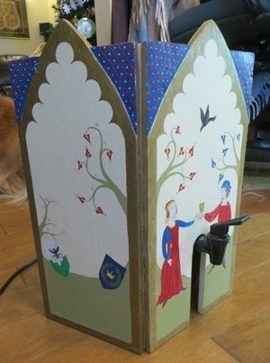
The Stronghold acquired a 30-cup coffee urn for hot beverages at our feasts: coffee, tea, hot chocolate, hot apple cider, mulled wine… The only thing is, it’s not very period-looking, and due to the way it heats up, the exterior can’t simply be painted or covered. So I decided to make a screen for it out of wood in the style of a Medieval triptych.
The tap sticks out of a cut-out in the middle of the center piece. I had a great deal of fun researching art styles and compositions on them, and overall shapes. At one point I was simply going to make it rectangular, with flat tops to each piece, as this best disguised the coffee urn and is perfectly period; but decided I liked the ones with a Gothic arch on top much better; they were more aesthetically pleasing to my eye, and looked more Medieval to it. So I compromised, with Gothic arches sticking slightly above a rectangular background. Cutting them out on the bandsaw was relatively easy, and I was able to use the narrow, vertical belt sander to shape them more precisely, before chiselling the painted rectangular backgrounds to each piece (the triangular blue bits iin the upper corners) down a bit, so as to bring the arches more to the foreground.
I painted each piece with a cream acrylic to give me a consistent base, but got fed up with the blotchiness and poor coverage of the darker knots, and moved to my gouache for the rest of it, with the exception of the gold paint, which I do not yet have in gouache.
May I take a moment to sing the praises of gouache? I first found out about it when I got some for the calligraphy and illumination workshop we did last year, and holy cow, it is amazing. If you’ve only ever used acrylics and watercolors, you MUST try some. It reconstitutes and thins with water but goes on smoothly and has a consistency one only dreams acrylics had. Plus it blends beautifully.
I painted up the three pieces of the triptych and hinged them together with some grosgrain ribbon attached with carpenter’s glue, so it ought to be pretty sturdily held together. Finished with a spray Varathane so we don’t have to worry about wayward liquids making the painting run.

The painting! There are some subtle Easter eggs in there! The device we’ve currently got submitted for the group is the one on the far left of the piece, with the green embattled inverted chevron representing the Annapolis Valley (and the embattling representing the military aspect of being a stronghold), with a raven displayed, clutching two laurel wreaths (originally one a wreath of apple boughs) above. Here, our couple, enjoying a lovely, presumably hot, drink, stand in a small valley, deliberately echoing the one on our device. While the colors are wrong, the lady is wearing a sideless surcoat as that is the first dedicated Gold Key garb we have. Her partner’s outfit has no meaning beyond matching hers. Above them flies the Stronghold’s raven.

The four devices on the two side pieces are of the three groups we find ourselves within: East Kingdom, the principality of Tir Mara, and the Barony of Ruantallan, with the two largest groups (kingdom and principality) being closest to the centre piece. I debated leaving our own device blank until we had it officially passed, but from a practical standpoint, once I’d covered the piece with varnish, adding it on would be difficult and would look weird; and from a historical standpoint, it’s the device we are submitting now. If it ends up changing before being passed, it’s still our device as of the moment in time that this piece was made, and stands as a testament to that, whatever the final result is. I think that is of historical interest.
As I said above, originally, the sinister wreath was made of apple boughs, but changed to a second laurel wreath after the Ruantallan herald advised us that it likely wouldn’t pass with it. So here, the branch overhanging our device bears apple blossoms, although it’s a little hard to see, especially in low light. I painted that one before I did the roses on the other side; if I had done it the other way around, I would have made the apple blossoms larger, to match them, making them more visible against the cream background.
As the hinging goes, I had wanted to do the little brass ones, but they were ridiculously expensive, so I went with my second option: the glued ribbon. But because the side pieces are each more than half the width of the center piece, it doesn’t fold flat. Many of the Medieval originals do, folding towards the front to protect the artwork when it is closed. Because this screen folds back instead, to wrap around the sides of the coffee urn, the artwork is exposed, although if it’s packed into a bag with the urn and the tap placed into the gap where the second side won’t quite fold flat, at least it ought to prevent the hinge from being forced too far and breaking if the bag gets bumped or sat upon or something.
Thinking about it now, though, I kind of wish I had glued it down slightly differently, because if, instead of just running it up the back of the gap between the pieces, I had glued one edge to the back, but then brought the middle through the gap and glued the other edge to the front (and then painted over it), so it was sort of Z-shaped, then it could have folded inwards as well as outwards, and the painting would have been better-protected while in storage. Still, I put quite a few layers of varnish on, so it’ll probably be fine.
We tried it out at Cheryl’s Christmas feast (I finished the last of the varnishing the day before) and I am pleased to say that it worked very well! I was very happy with the result, the effect, and its reception.
Currently, the urn and screen are being kept in with the Gold Key stuff.